Internal workflows needed a broader view
Internal users managed campaigns across multiple vendors, but LOOP was structured around a single-vendor view, forcing extra navigation and context switching.
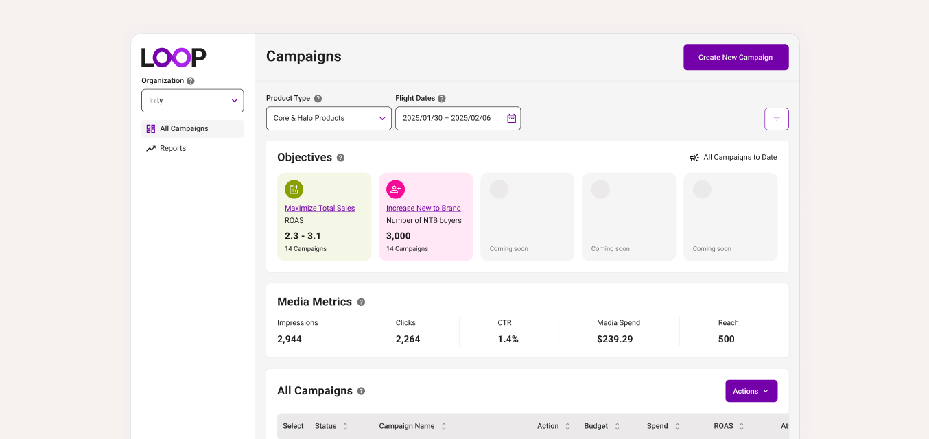
LOOP is Loblaw’s retail media platform for creating and managing omnichannel campaigns across channels like onsite media, Meta, and YouTube.
Most of the early product focus went into the campaign creation experience, while reporting was handled more reactively. But without a clear way to understand performance and catch issues early, teams had less confidence using LOOP as the place to manage and grow campaign performance.
I pushed for the team to revisit reporting and define what this part of the product needed to support. I led the foundational work myself, identifying user needs, defining business goals, and using competitive analysis to guide decisions around filters, tables, and reporting patterns.
Clearer reporting helped teams make stronger optimization decisions, helped position LOOP for additional $2M+ in estimated annual revenue potential, and secured continued investment in reporting across future sprints.
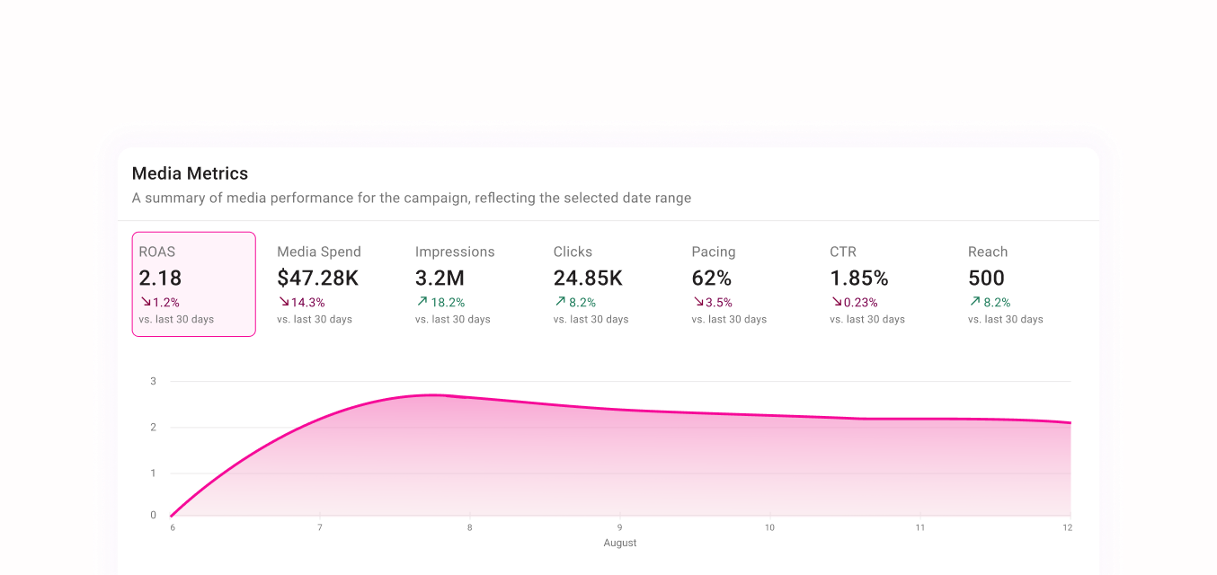
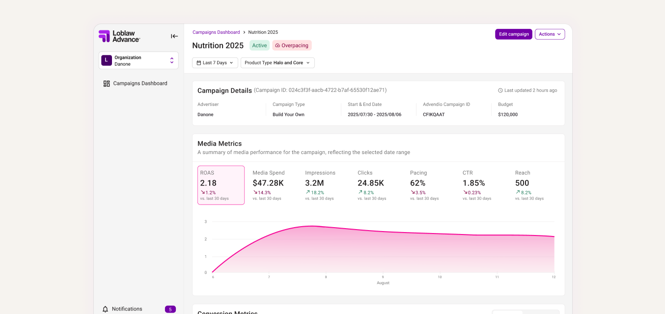
A summary of media performance for the campaign, reflecting the selected date range
August
Through conversations with internal users and a focused competitive analysis, I looked at where LOOP’s reporting experience was falling short and what teams expected from a campaign performance dashboard.
Internal users managed campaigns across multiple vendors, but LOOP was structured around a single-vendor view, forcing extra navigation and context switching.
Pacing and performance problems were not surfaced clearly, which made it harder to catch issues before they affected campaign outcomes.
The date range filter was unreliable, and the overall filtering model was not flexible enough for how teams needed to compare and monitor campaign performance.
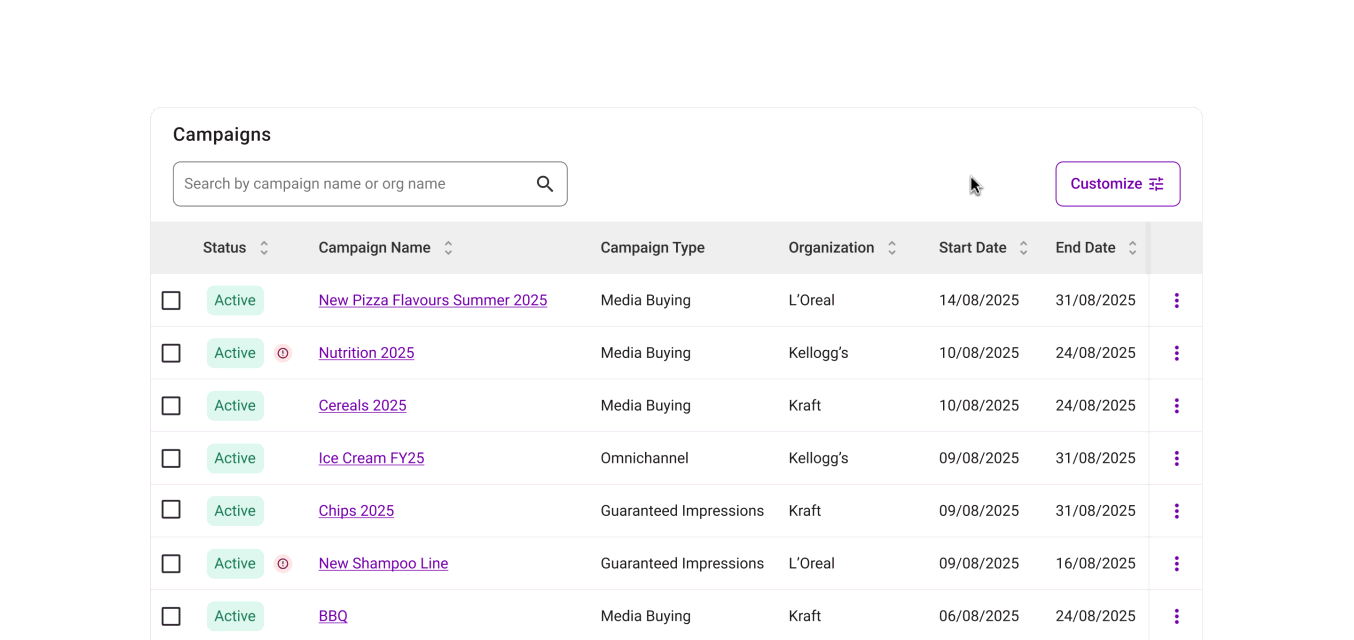
The campaigns table was the main place users looked to understand performance, but key actions, metrics, and column controls were not easy enough to access.
The goal was to make reporting feel less like a static dashboard and more like a tool for managing campaign performance.
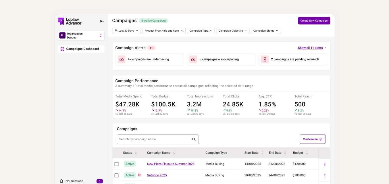
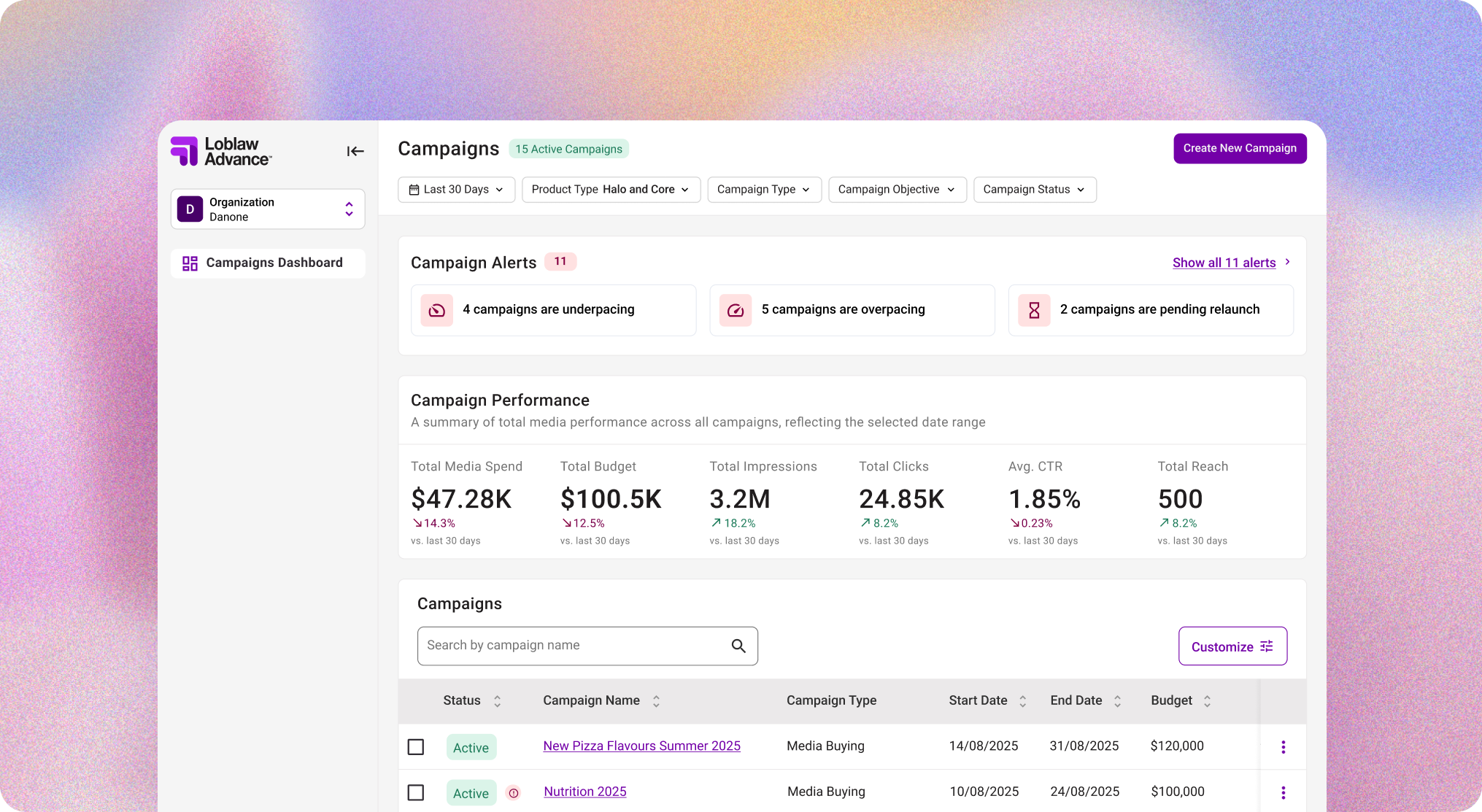
I designed an admin view for internal users who managed campaigns across multiple vendors, giving them one place to monitor performance, pacing, and campaign issues across their full portfolio.
Because LOOP was originally built around a single-vendor view, users still needed to switch into a specific vendor workspace to edit a campaign. I added a clear return path between views so they could move in and out of admin mode without losing context.
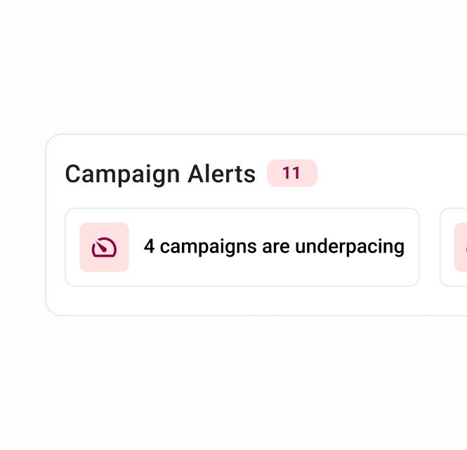
I designed an alert widget that made campaigns requiring immediate attention visible as soon as users landed on the dashboard.
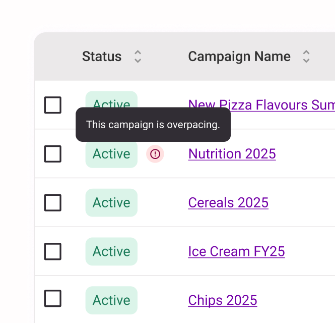
I also added inline table alerts to show which campaigns were affected and what needed action, giving users more context without forcing them to dig into each campaign.
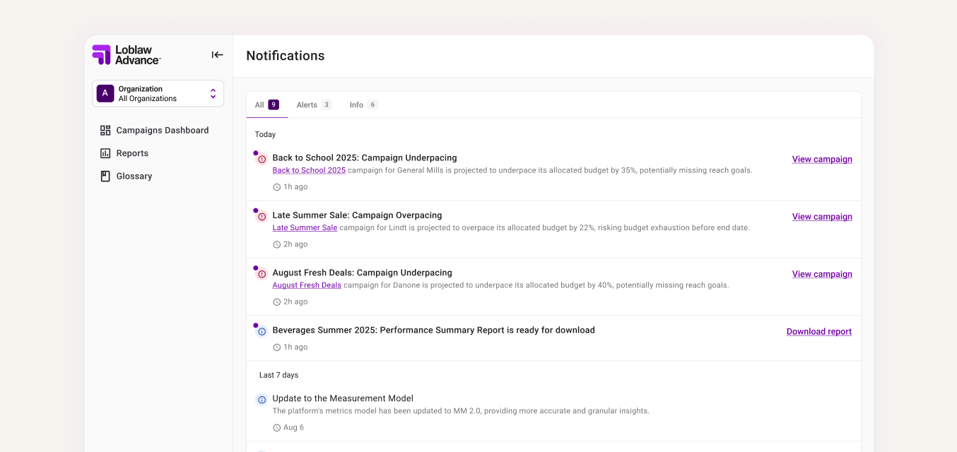
Once I introduced dashboard alerts, I saw an opportunity to connect them with other platform updates that had been handled through temporary messages because of earlier resourcing and technical constraints.
With product and engineering aligned that a more permanent pattern was now feasible, I designed a notification center where alerts, report downloads, and campaign activity could live in one place. This gave users a clearer way to track important updates and return to them when needed.
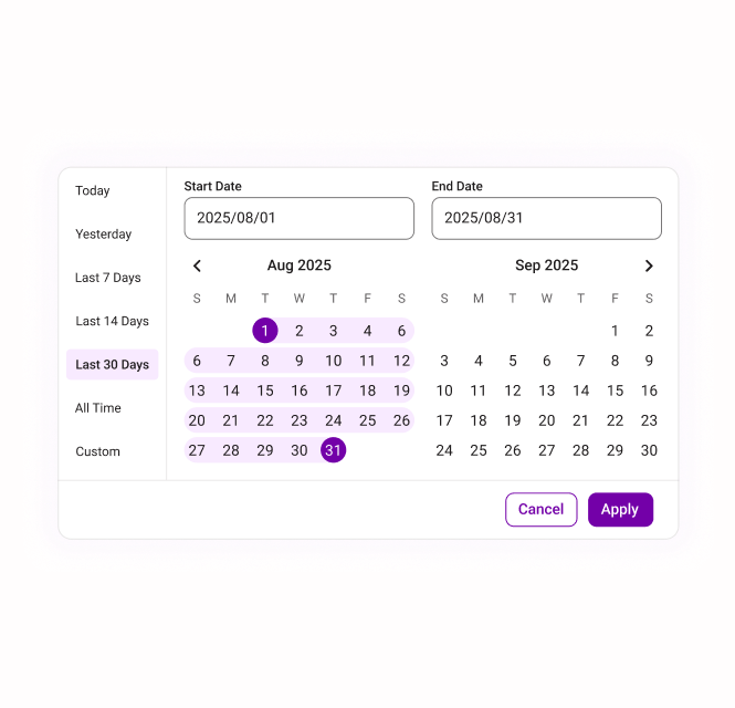
I redesigned the date range filter so it applied consistently across all sections of the dashboard and gave users more control over how they viewed campaign performance over time.
I added expected patterns like preset ranges, custom date selection, and an all-time view, then surfaced key filters outside of the drawer so power users could adjust the report faster.
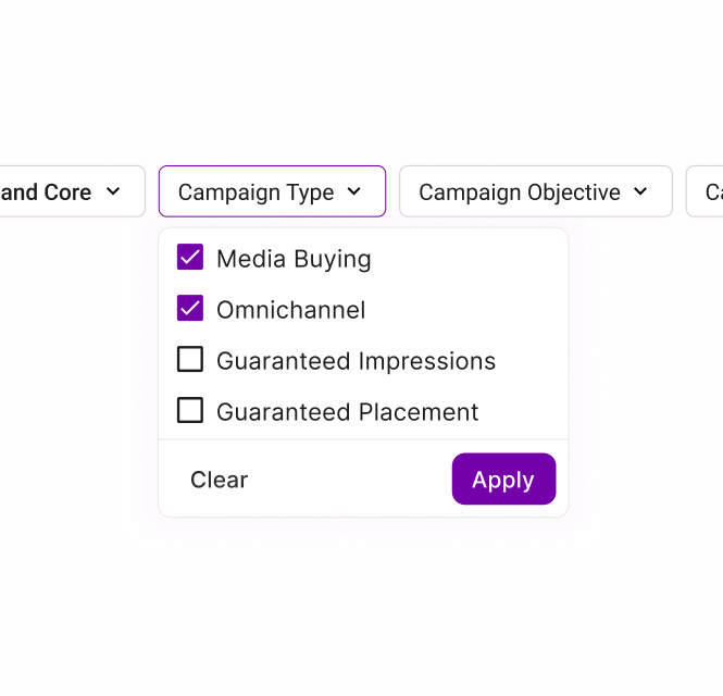
I added column customization so users could choose the level of campaign data they needed, instead of forcing everyone into the same default view.
I also grouped key campaign actions, like editing or duplicating a campaign, into one consistent place and made them accessible while scrolling so users could act on campaigns without losing context.
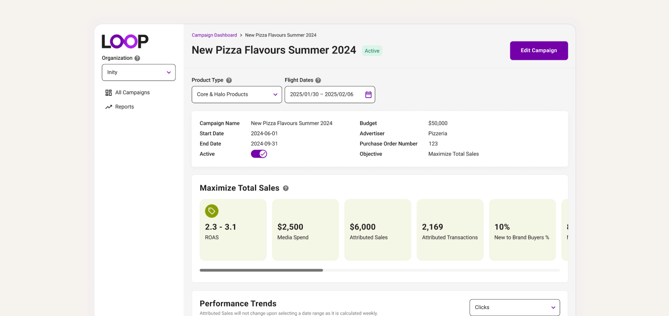
I redesigned the campaign details page to group related metrics, charts, and campaign information together. This reduced repetition and made deeper performance analysis easier to scan and understand.
I enjoy projects where the design work starts before the requirements are fully defined. For this dashboard, that meant helping shape the product direction first, then designing the experience that could support it.
Some users needed a quick read on campaign health. Others needed more control over the data. I had to be intentional about where customization appeared so the dashboard stayed useful without becoming overwhelming.
I saw a lot of opportunities to improve the dashboard. The first iteration had to focus on the changes that solved the biggest user problems and could realistically move forward with product and engineering.
Not every improvement needed to happen at once. I had to decide which visual and interaction updates would make the biggest difference, and which ones could wait for future iterations.